10.28.2010

some good contemporary artists

they are out there, the rumors are true.

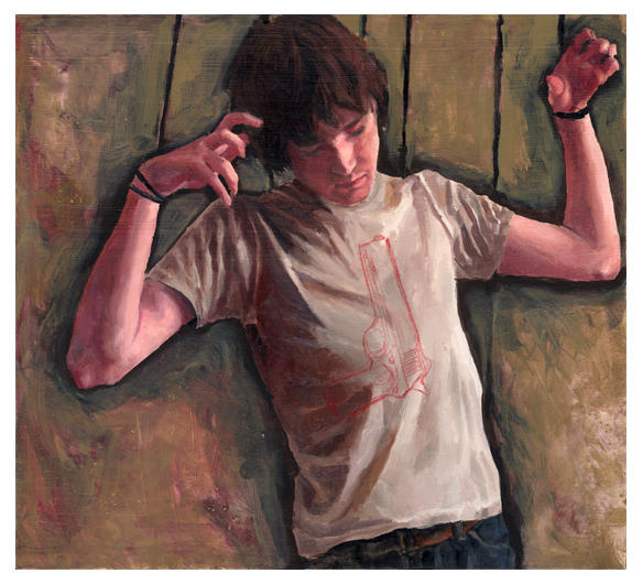
exile
adam miller.

he paints like the old masters, and had a similar upbringing too.  he began as an apprentice when he was 13, accepted into florence academy of art by 16, toured europe studying the masters, and has since received all sorts of awards.  i'm pretty sure that story (give or take a few years for the ages) can be applied to a slew of artists from the renaissance.  not so many contemporary ones, though.
but adam miller goes much further than following the skeleton cliche life structure for a master painter, his technical skill is comparable to any painter in an art history book.  and maybe it's the red fabric, but he reminds me of titian with a mute color palette.  and a little bit of traditional dutch painter in there too, something about the skin...

pleasure


beth cavener stichter

whaaaat?  awesome sculpture.  looks like she threw a bunch of clay together and it happens to look exactly like a wolf.  and this is no accident.  every single one of her sculptures are the most alive looking thrown together lumps of clay i've ever seen.


ecstasy of austin kincaid
james roper

so hard to pick just one thing.  so i won't.  all of his work is so different.  his paintings looook like there are figures all over the place but for some reason i just can't find them.  and his drawings seem like just lines and colors until a closer look that shows they're people.  and his sculptures are inanimate all around.  great.

the involuted submergent


i like figures.  i like fabric.  so does she.  and she paints them really really well.

addiction

10.26.2010

the horror

untitled 2001


gregory crewdson:


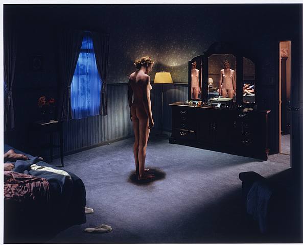
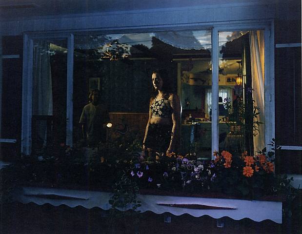
all of his photos look like something horrible just happened. something horrible and devastating and life shattering. these are not good choices of art for a child's room.


untitled 2001
all of the people look very stiff, tense.  and the small signs of life around them make them so much more real, and imply that they were very normal until just a little while ago


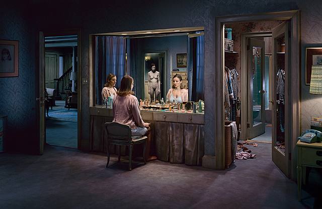
my favorite is the last one here, untitled winter 2005.  that creepy lady in the back makes this one stand out against the rest.  in the others you can tell that things aren't alright, but this one actually has a source for the tension.  also, the three mirror deal reminds me of this really terrible horror movie i came across in high school about a lady with multiple personalities, lizzie
untitled 1999
untitled winter 2005

10.22.2010

resource wars

caribou migration - pregnant caribou migrating to the
coastal plane (where they give birth, and where the oil is)
at this very moment, this very moment that i am typing, i am at a lecture by subhankar banerjee.  it just started.  ::his:: blog can be found here.

he took photographs in the arctic national wildlife refuge to raise awareness about climate change and global warming and how it's affecting our world.  he began his higher education in engineering, grad school for computer science, and began photographing his travels in america as a grad student.  from there he continued his photography as a hobby, until he quit his job with boeing and became an official artist.  he wanted to find pristine wilderness, which is difficult.  thus, alaska (keep in mind he grew up in calcutta).

first thing he learned: slow down.  (the blizzards get in the way of hurrying very much there)

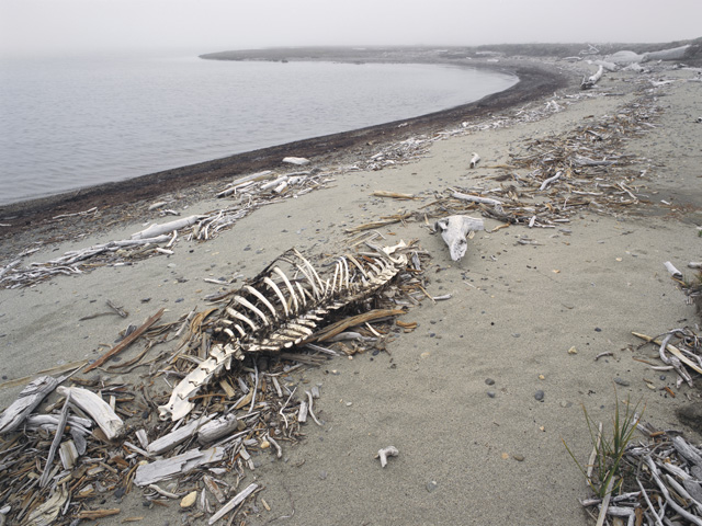
caribou skeleton - during their first long distance migration - caused by
their normal feeding ground freezing - hundreds of caribou froze themselves
his pictures are gorgeous.  they really convey the beauty and purity that he was searching for, and the frailty of the environment.  he purposely took photos with muted colors as a political move.  the arctic was always described as a 'hostile wasteland' and other such unappealing descriptions that encouraged those that saw the land as only good for oil.  he wanted to show the land as something alive - full of birds that migrate from all over the world, connecting it to every part of earth, along with caribou, wales, and fish that connect indigenous communities.

he was inspired by millet's commentary on society and human rights issues.  his photographs are intended to increase awareness about the damage being done to wildlife due to greed for oil as well as negative effects on indigenous communities that are so often forgotten by politicians and civilians.

caribou tracks on wetlands ii
the oil underneath the arctic refuge that drillers want to reach is said to last for 400 years, which, subhankar pointed out, would kill us if we keep using fossil fuels as we do now.  the land over this oil is also crucial for survival of four different indigenous tribes, as well as endless amounts of wildlife.  climate change is already killing increasingly more caribou calves, destroying homes of polar bears, etc. etc.

apart from the politics, he has a wonderful sense of composition and color.  are his photographs minimalist because he was in alaska or was he drawn to alaska because of his minimalist tendencies? either way, his methods work well with his message.


my favorite part was when he was talking about photographing a bird mating dance and he said he was most excited that it was an all brown color palette.

10.20.2010

it's close to midnight...


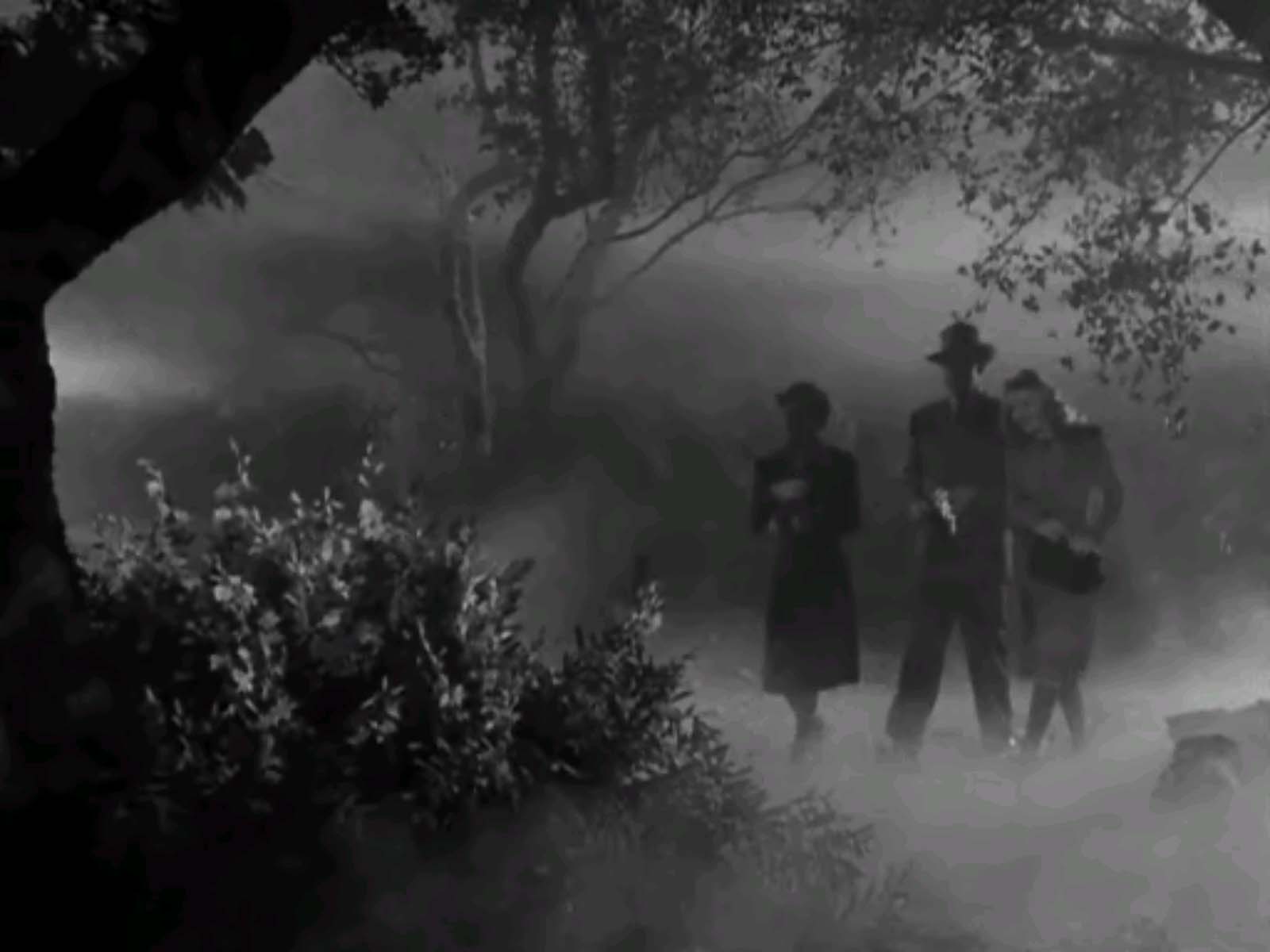
thrillers.  i don't watch many of those.  but i will paint one, i guess.  currently i'm thinking something old style - a bit ridiculous, like the 50 foot woman.  hmm.  silhouettes and high contrast and shadows.  maybe like lepus.  hah.  what if i paint just tons of rabbits? 

no clue.  or maybe i can figure out a way to fill the diorama with smoke.

i will continue thinking.  i like the figure, i like fabric, i like contrast, hmm.

or maybe i take a completely different route and go for the all too perfect creepy feel.  funny games style.  (let me add that i haven't seen most of these movies, but the previews really to tell a lot, especially about how the thriller aspect is set up).  we shall see.

10.14.2010

face it

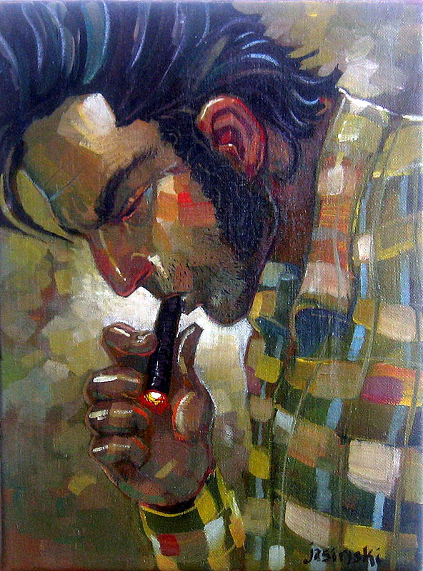
in thoughts of self portraits i have combed through deviantart and found some i like.  now, there are tons i like, but as far as inspiration for a self portrait goes, i'll only put up those that i can relate to, stylistically.  annd here they are:
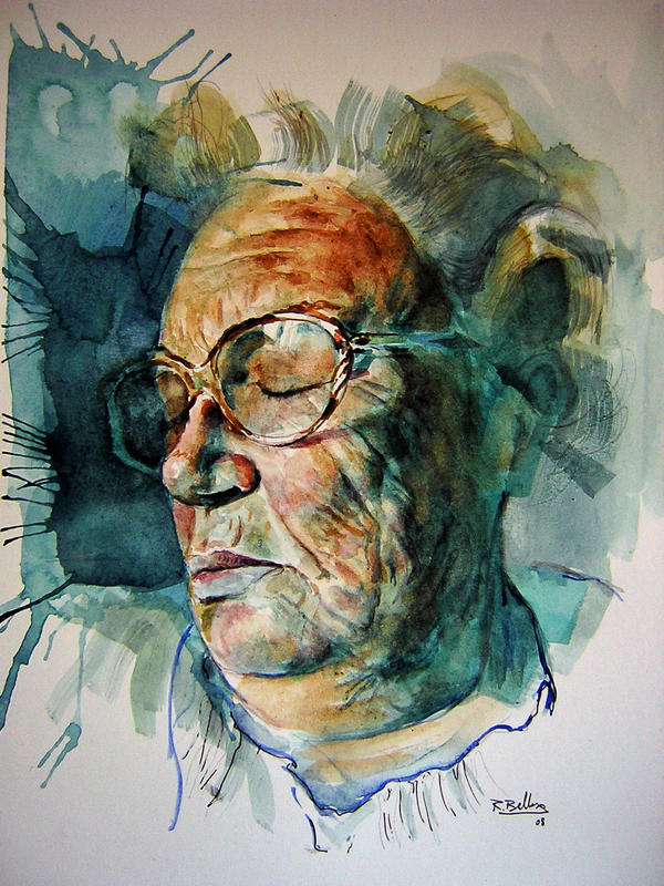
http://benbe.deviantart.com/art/grandmother2-88727732

http://wakkawa.deviantart.com/art/Britlawls-67662075
http://aroulette.deviantart.com/art/Puppet-16574561
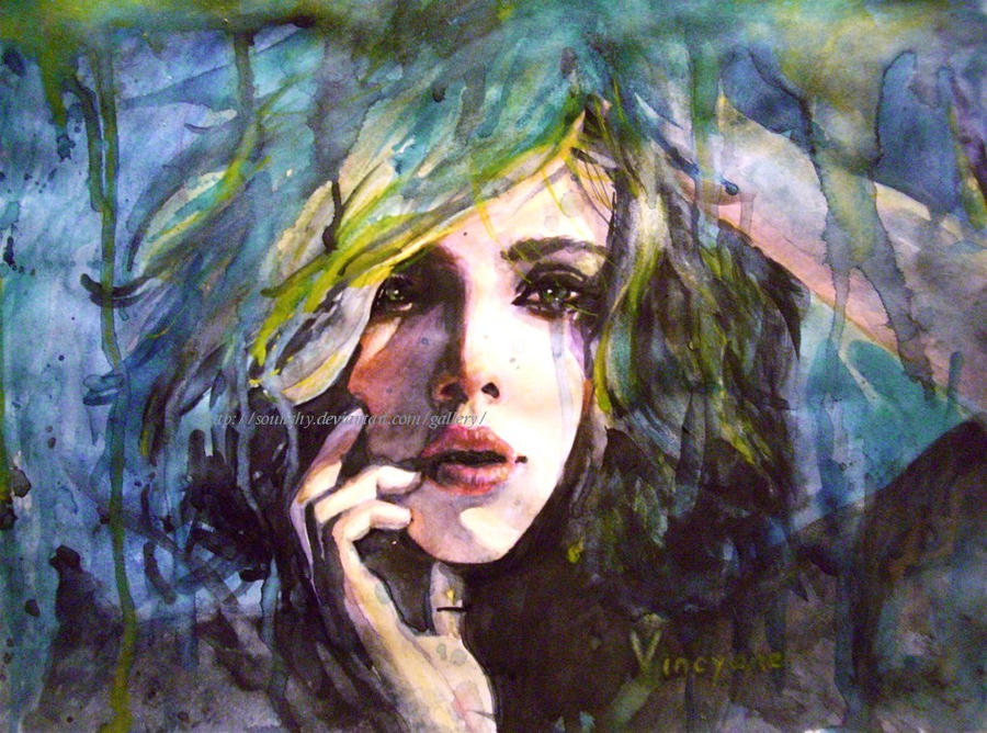
http://sounchy.deviantart.com/art/Feeling-the-loss-149851258
http://jasinski.deviantart.com/art/Logan-74821194

10.09.2010

ed hardy

ed hardy sucks.  horrible.  embarrassing for those of us that actually do have tattoos.  insulting to people who actually know what koi and sparrows represent.  ugh.  plus, the shirts are tacky on top of it all.  as are the hats, socks, jackets, pants, swimsuits, underwear, shoes, and every other form of apparel and accessory they're able to put an image on.  if i saw this bedspread in anyone but an angsty 6 year old's bedroom i would immediately have the urge to burn the whole room.  especially because it would probably signal that the closet is filled with similarly horrible fashion choices.  i'm sorry if you like him.  and i hope that you immediately reconsider.

i feel like it insults any tattoo artist with any amount of self respect.  and there are some amazingly fantastic ones out there.

amory, peace cranes
amory abbott, in indianapolis, is one such artist.  i would love to get a tattoo from him.  maybe that's what i'll do with my birthday money...

first of all, it's a sweet tattoo.  second of all, fantastic work.  most tattoo artists have similar styles, with the variation between work mainly coming from skill.  i feel like amory approaches tattoos in a different way.  his colors, too, aren't quite what you'd expect on a tattoo.  i think it's because he understands the effect the skin tone will have with the overall look.  his blues don't look sickly, they look bright blue and 100% independent of the skin they're on.
amory

he also has an art/illustration blog that is full of more awesome work.

(<- i mean, look at that.  from a spoon inlay.  nuts.  that'd be impressive on paper, much less human flesh)


another artist (not tatto, nor local, but still awesome and a really cool guy), phil lewis, somehow reminds me of amory.  maybe it's the colors or the illustrative quality of the work but... they're both great.
 phil lewis, magnolia moonrise

dina verplank
back to the topic of amory, he used to work at the voltua tattoo parlor (when i heard about him a few years ago from some guys at a bar - best bar conversation with strangers i've ever had).  as i said, he doesn't work there anymore, as far as i understand, but the artists that are still there are pretty fantastic too.   they all have similar non-traditional-tattoo styles and use really vibrant colors.  this one to the right is dina verplank, and below is laura black.

ah, maybe i'll get another.  they're great.  and ed hardy sucks so much more thanks to these artists.  ugh.

10.04.2010

the paint

in preparation for figure painting, i figured i'd look at some paintings.  i really am partial to drawings myself, so some of my favorite paintings have the underdrawing or unfinished parts showing through.  being able to see the process leaves so much more to explore in the painting.  a few clues as to how it was started sparks a whole internal dialogue to try and figure out the rest.

i have trouble finding many contemporary painters i really like.  i'm not sure why.  maybe it's because the internet allows every painting they've done to be displayed, whereas in the previous generations we only saw their top work, for the most part.  hard to say. 

This painting is by christopher nolasco, titled danielle #2.  some of his paintings seem too commercial - as if while he was painting it he was thinking about who he's trying to mass market it to.  he has a whole string of musicians and athletes and world leaders.  but apart from his subjects and intent, there are some really beautiful moments.  i love how this one stays messy, transparent, but still has fully developed shadows.  it's hard to leave unfinished edges right next to crisp lines without it being too overworked.

the late kent bellows did remarkably accurate drawings and paintings.  honestly, they look like photographs, but with more life to them. this is danuda sitting, graphite on paper.  i would have sworn it was a photograph. 
below, his self-portrait titled gluttony, is a masterpiece.  it reminds me of the paintings done in from the renaissance on as a way to show off a painters' skill - all sorts of colors and textures thrown together.  and bellows met the challenge of sending us realistic grapes, pearls, and pumpkins, all in front of his own face, challenging us to approach him.  his references, as i see them, lean towards the dark humor side of things - he's tying together all sorts of academic painting types - still life (with fruit, nonetheless), a stormy seascape, a religious painting, and a portrait.  go big or go home, i guess.


also shown at the forum gallery alongside bellows are other fantastic realism artists like jeffrey gold, jane lund, and alan magee.

jeffrey gold, seated model with zebra skin
 
jane lund, chinese dog, mexican squash
alan magee, chronicles
ramón, descanso de la diva
from my years prowling deviantart i have found many artists that impress and inspire me, and ramón (whoever he is) is one of them.  his focus is completely on the figure, and the background is used only to accent the skintones.  in many of them, the figures look more like cutouts placed over his backgrounds, there is no three dimensional space to speak of once your eye moves off of the model.

ah, one day my painting might catch up to my drawing.  but at the present i have a very long way to go before i understand colors like these artists do.