
12.26.2010

12.16.2010
paper for peru
so since using this blog to compile images worked so well last time... lets use it for this too
"Creating design and imagery through the use of colour – painting, block printing, batik, plangi, tie-dye (shibori), ikat"
block printing: originated in asia; multiple blocks used for multi-layered colors; can be done by stamping (usually with fabrics), rubbing (paper & cloth), or with a press
 batik: originated in indonesia; done using was resist on fabric, then dye; colors can be layered with addition of wax after each dye
plangi: originated in peru; tie-dye; fabric is bunched and bound before it is dyed
shibori: japanese origins; similar to plangi - bunch, bind, stitch, fold, twist, compress, or cap cloth before dying; these variations are called: kanoko, miura, kumo, nui, arashi, itajime
ikat: common to many cultures (indonesian, many south american countries, asia, india); dye & weaving technique - dye either warp or weft threads first, then weave them into a pattern
"Creating design and imagery through the use of colour – painting, block printing, batik, plangi, tie-dye (shibori), ikat"
block printing: originated in asia; multiple blocks used for multi-layered colors; can be done by stamping (usually with fabrics), rubbing (paper & cloth), or with a press

plangi: originated in peru; tie-dye; fabric is bunched and bound before it is dyed
shibori: japanese origins; similar to plangi - bunch, bind, stitch, fold, twist, compress, or cap cloth before dying; these variations are called: kanoko, miura, kumo, nui, arashi, itajime
ikat: common to many cultures (indonesian, many south american countries, asia, india); dye & weaving technique - dye either warp or weft threads first, then weave them into a pattern
12.10.2010
11.22.2010
sketch
soooooooo here are the sketches
 |
| magician holding a staff/wand, surrounded by an infinity sign, lilies, roses, wearing a crown/halo |
 |
| priestess in front of a pomegranate curtain, holding a staff, crescent moon in front, headdress, lotus flowers |
11.20.2010
moda
i like em.
or rather, i like how they approach things. especially in the context of what i'll be working on - big scale, only a few weeks to do two.. hopefully it'll work out.
patrick earl hammie
or rather, i like how they approach things. especially in the context of what i'll be working on - big scale, only a few weeks to do two.. hopefully it'll work out.
patrick earl hammie
 |
| no 3, oedipus drawings |
 |
| recognition, equivalent exchange |
 |
| molehill |
 |
| jojo |
 |
| n/a |
 |
| n/a |
11.15.2010
style
so i want to be messier. i can do cluttered, and the somewhat cliche methods of messy - drips and splatters and blobs. but those tricks are like wearing 80s clothes, you have to be really careful about how far you go with it or else it could start looking like a joke.
so for some brainstorming...
 jenny saville.
nice. a bit too ... sharp? i like that the shadows and planes of the faces are scattered, but i was thinking more of the outlines too. the background moving in over the foreground and that sort of thing.
 yan pei-ming.
more towards the break-the-outline end, but the brushstrokes are too monotonous. really impressive that the contours of the face can be expressed with such repetitive marks, but i guess i have something more chaotic in mind - in some respects, at least.
 hung liu.
closer, closer. especially with the random objects that are intertwined with and around the figures. and the vague, stylized background is nice too - suggestive of just enough things that you can't quite tell which one it is. although the outlines of the figures are back to being pretty solid.
maybe these two forms of chaos - of form un-definition and plane messiness - don't work well together. but i'd like them to, somehow...
 al farrow.
ok, so i came across him by accident while looking for a good egon schiele example, and like this better - at least, for this topic. mainly because it's sculpture and still looks messy and like it might get you covered in paint if you touch it.
really effing great artist. happy find.
 frank auerbach.
so he has paintings that work for this too, but i'm always a bit partial to a good quick sketch.
also, is it just me or are painters from the 30s and 40s some of the easiest to identify? really, their color palettes alone give them away. i don't know what it is.
alright. well. no bingo yet. i'll keep perusing.
so for some brainstorming...

nice. a bit too ... sharp? i like that the shadows and planes of the faces are scattered, but i was thinking more of the outlines too. the background moving in over the foreground and that sort of thing.

more towards the break-the-outline end, but the brushstrokes are too monotonous. really impressive that the contours of the face can be expressed with such repetitive marks, but i guess i have something more chaotic in mind - in some respects, at least.

closer, closer. especially with the random objects that are intertwined with and around the figures. and the vague, stylized background is nice too - suggestive of just enough things that you can't quite tell which one it is. although the outlines of the figures are back to being pretty solid.
maybe these two forms of chaos - of form un-definition and plane messiness - don't work well together. but i'd like them to, somehow...

ok, so i came across him by accident while looking for a good egon schiele example, and like this better - at least, for this topic. mainly because it's sculpture and still looks messy and like it might get you covered in paint if you touch it.
really effing great artist. happy find.

so he has paintings that work for this too, but i'm always a bit partial to a good quick sketch.
also, is it just me or are painters from the 30s and 40s some of the easiest to identify? really, their color palettes alone give them away. i don't know what it is.
alright. well. no bingo yet. i'll keep perusing.
11.02.2010
diptych
 final project for painting 3: two related paintings.
i like beauty, i like allegories, i like mucha, i like lavish fabric and aestheticism and rich colors and a lot of information
i'm thinking 2 paintings that would fit on either side of a door or wall opening, so about 72" tall and 44.5" wide (6'x3.7') - golden ratio style.
the golden ratio itself is interesting a concept that spans from math to art and, most importantly, in nature.
but that's somewhat arbitrary to what i'm planning on. well, i might incorporate the spiral into the composition of the painting somehow, but that's much further ahead than where i'm at.

my subject matter i want to be two complimentary or contrasting ideas. after running through a long list of ideas, i fell upon two related cards from a tarot deck: the magician and the high priestess. i'm not overly knowledgeable regarding tarot cards, but i've always liked how each card is a representation of a larger idea, to be interpreted in various ways, and able to be represented in even more ways. looking through different decks show endless interpretations of the different cards. i've always liked the differences between decks, and even more i've liked the similarities between the same card in different decks - the essential information that makes the card identifiable despite having completely different images between sets.
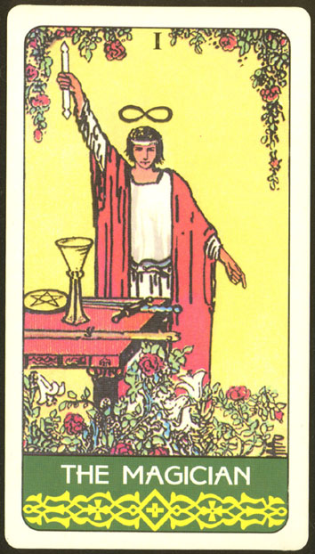
- meaning: powerful, charming, male creation by willpower and desire, charismatic, clever, provides an easy solution to problems, persuasive, possible doctor/scientist/inventor, revelation of new ideas, manipulation, creativity, practicality, recreation, scholarly knowledge, potential of a new journey, 'bringing the fool from the cave of childhood into the light of consciousness'
- visual characteristics: halo, wand (club, of one of the suits) pointed to heaven & finger pointed to earth, table with items that represent the other suits (cups, coins, swords), youthful and attractive, infinity sign over his head, ouroboros belt (snake eating its tail), roses and lilies at his feet, sometimes crowned by snakes, richly dressed (back in the day he wore a hat, red leggings, red undershirt, yellow vest thing, and blue trouser things, more modern depictions show him in a red robe with white underclothes)
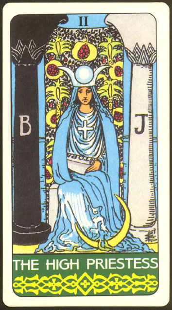
the high priestess:
- meaning: quiet, omniscience, secret knowledge, instinct, solitary investigation, obscure information, wisdom, serenity, inner voice, faith
- visual characteristics: blue/white/black, pomegranate curtain behind her, crown of isis, veil, crescent moon by her feet, lotus, 2 pillars (one w/ b=boaz, j=jachin), scroll in left hand, staff (maybe w/ cross) or key in right hand, sitting, night, wearing a greek cross,
and, of course, some pretty art nouveau tarot as examples
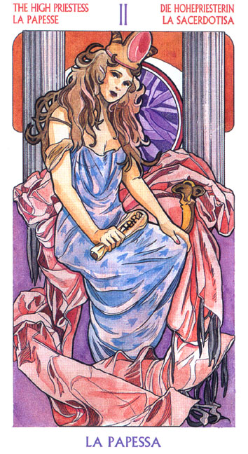
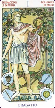
i think i'll be going less on the design-route, though. probably something closer to mucha's paintings - still art nouveau but not so stylized. no frames or anything. much more lush and glowing.

Subscribe to:
Posts (Atom)